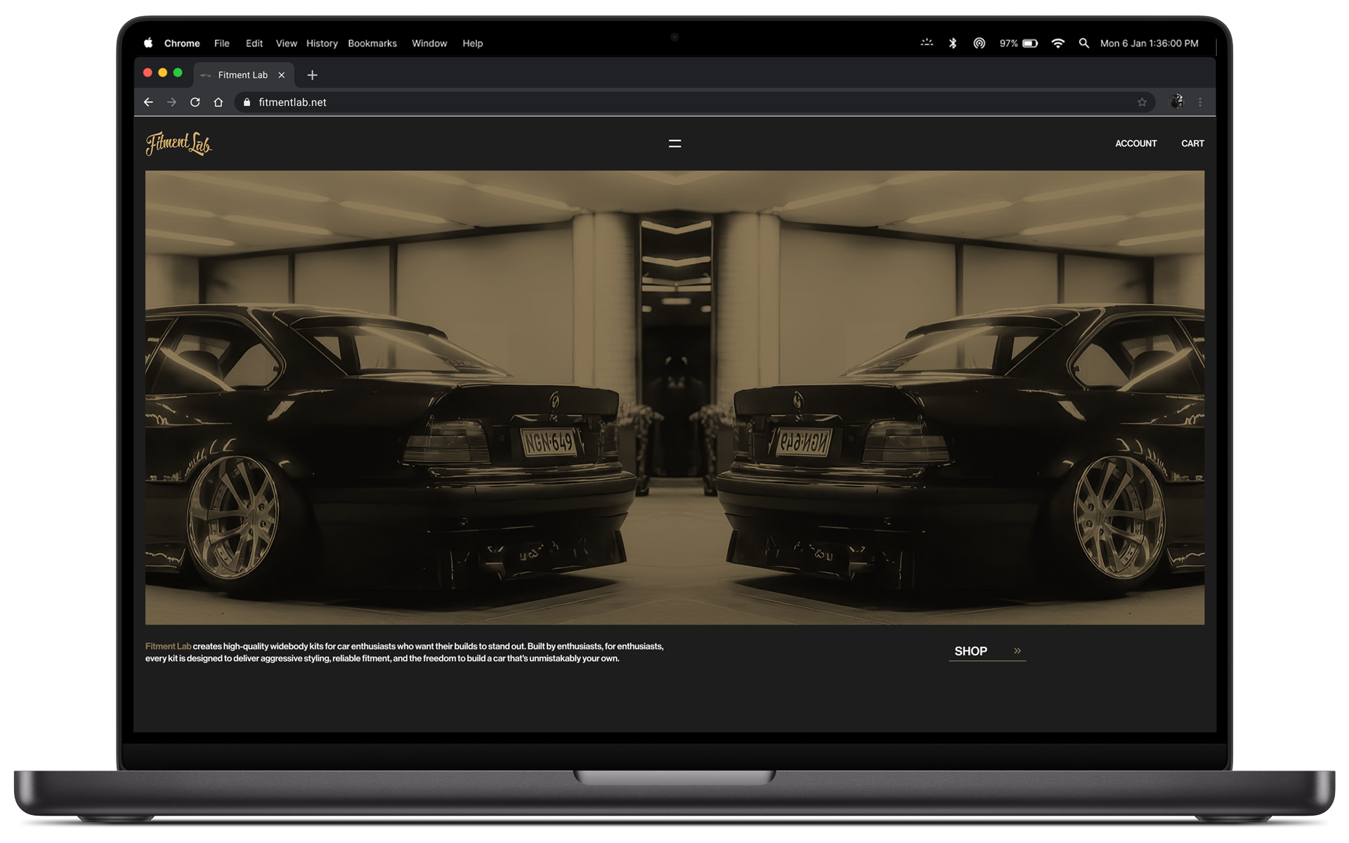
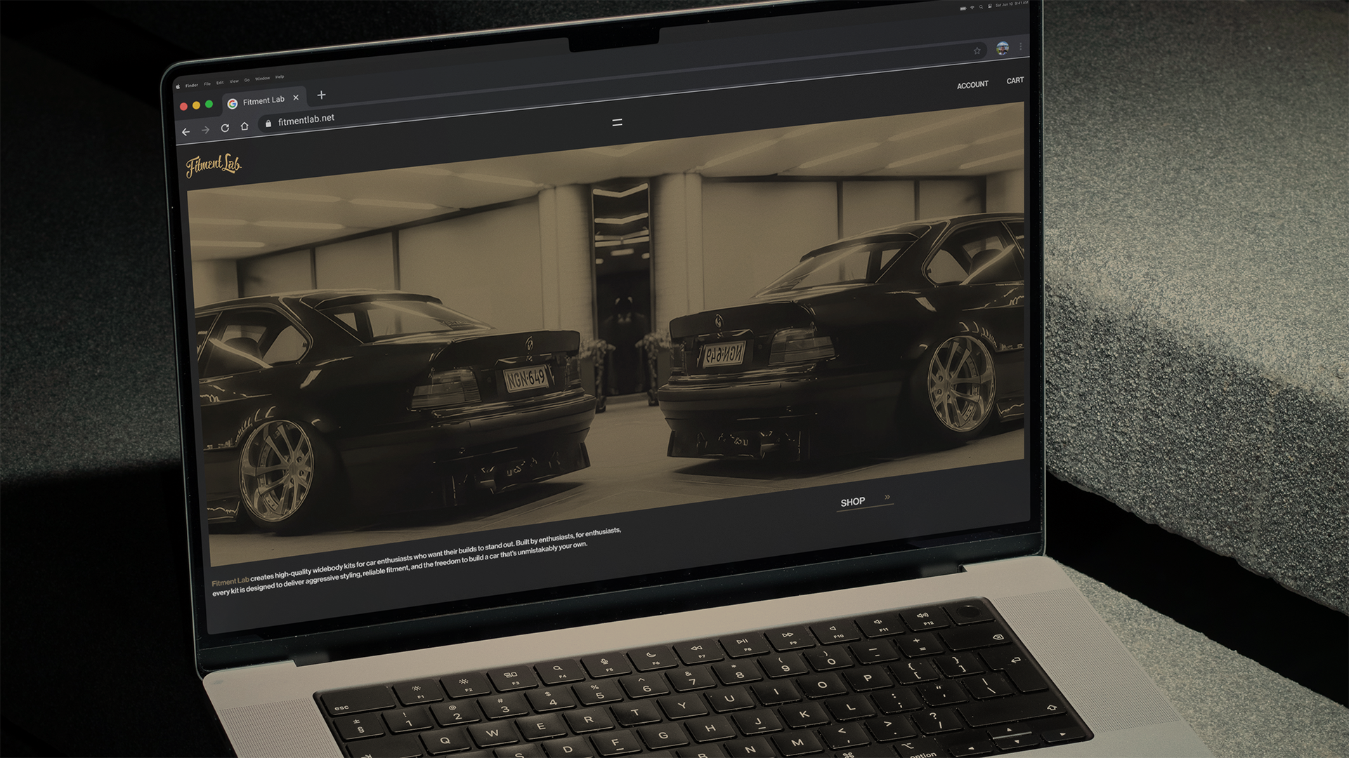
Reimagining an automotive brand's e-commerce experience around it's products culture, and enthusiast audience.
This was a self-initiated redesign, completed independently and without involvement form Fitment Lab.
Product & Web Designer
my role
UX/UI, E-Commerce, Art Direction
scope
Figma, Photoshop
tools
Self-Inititated / Conceptual
type
introduction
fitment lab
Fiberglass bodywork gives automotive enthusiasts an affordable way to dramatically change a car's proportions, accommodate wider wheels, and create the clearance needed for extreme steering angle. But it also has a reputation for inconsistent fitment, poor panel gaps, and requiring extensive bodywork before it looks right.
Fitment Lab has built its reputation by challenging that expectation. Their widebody kits combine aggressive styling with unusually good out-of-the-box fitment, while remaining accessible within a market where comparable products can become expensive quickly.
As an enthusiast myself, I saw an opportunity to translate those same qualities into the brand's digital experience: aggressive in character, but precise in execution.
The best, or nothing.
the opportunity
fitment lab
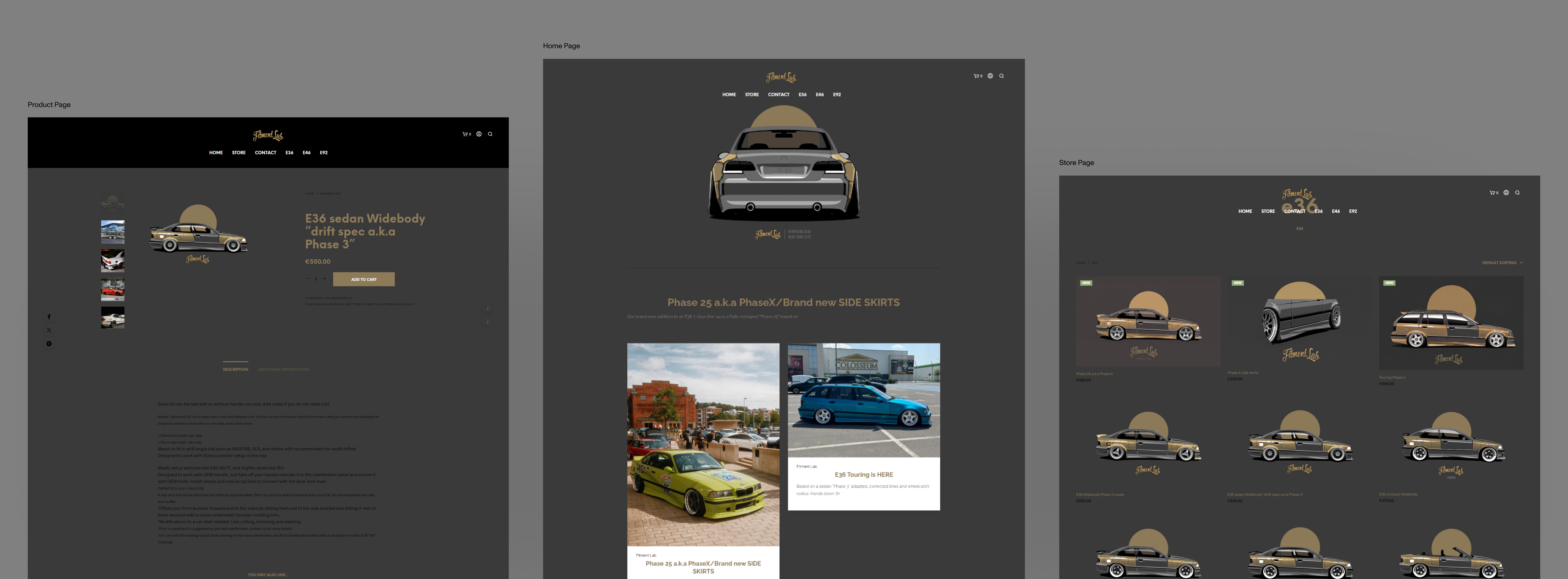
The products have character. The website doesn't.
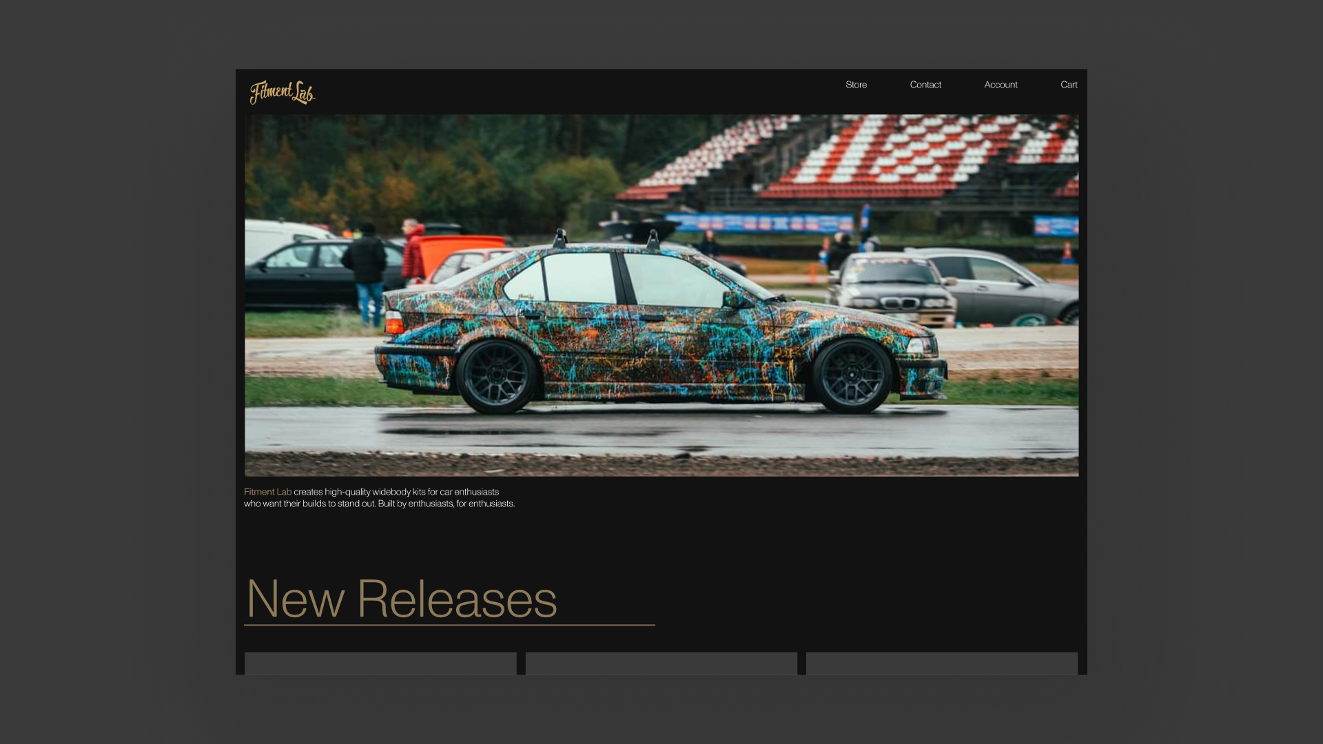
Fitment Lab already had a distinct voice, strong photography, and products designed for a very specific enthusiast audience. The existing website, however, treated those products through a fairly conventional e-commerce structure.
I identified an opportunity to create an experience that better reflected the culture surrounding the brand while improving product discovery, navigation, and the presentation of Fitment Lab's catalog.
The existing experience.
01
Product Discovery
Fitment Lab's products span multiple chassis and body styles, making the vehicle itself a natural starting point for discovery. Rather than browsing an undifferentiated catalog, an E36 owner should be able to quickly narrow the experience to products designed specifically for their car.
02
Product Presentation
The products are highly visual, but inconsistent imagery and limited separation between product cards make the catalog difficult to scan. Similar colors across the imagery, cards, and page background cause products to blend together, making individual items harder to distinguish at a glance.
03
Brand Expression
Fitment Lab's products are defined by aggressive styling and unusually precise fitment, but those qualities aren't fully reflected in the existing interface. The level of care that goes into the products doesn't consistently carry through to how the brand is presented online.
visual direction
fitment lab
The product is aggresive. The execution is precise.
Fiberglass bodywork has a reputation for requiring extensive adjustment to achieve clean panel gaps and proper alignment. Fitment Lab's products stand apart by offering aggressive styling with unusually good out-of-the-box fitment while remaining relatively affordable within the market.
I wanted the website to express that same contradiction. The cars and photography would provide the aggression; the interface would provide the precision.
I looked to automotive culture and architecture for two sides of that visual language—aggressive forms, extreme proportions, and raw materials contrasted with structure, alignment, repetition, and carefully controlled space.
The cars provide the attitude. The interface provides the precision.
exploration
fitment lab
Finding the balance between expression and restraint.
exploration 01
fitment lab
Establishing the foundation.
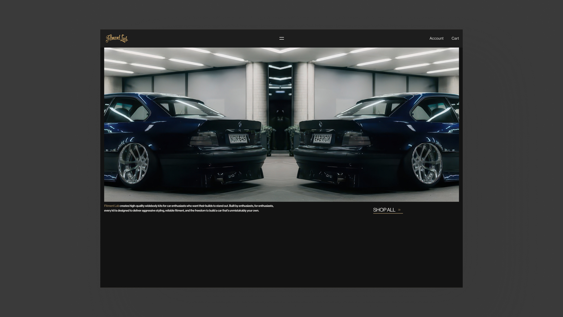
The first direction established the basic structure of the redesign; a darker visual environment, strong product imagery, simplified navigation, and a more deliberate relationship between commerce and editorial content.
I improved the clarity, but still felt closer to a refined version of a conventional automotive e-commerce site than a distinct expression of Fitment Lab.
exploration 02
fitment lab
Pushing the identity
The second direction pushed much further. Larger typography, more expressive compositions, strong color fields, and unconventional editorial layouts gave the brand a much more recognizable visual identity.
The experimentation helped define what the redesign could become, but it also revealed where expression began competing with the products themselves.
The strongest ideas weren’t necessarily the loudest ones. V3 became an exercise in keeping the character V2 uncovered while removing everything that didn’t’ need to be there.
final direction
fitment lab
Precision through restraint.
The final direction refined the strongest ideas from the earlier explorations into a quieter, more disciplined system. Decorative elements were reduced, layouts became more deliberate, and hierarchy relied increasingly on proportion, alignment, typography, and negative space.
Rather than competing with the products, the interface became a framework around them.
navigation
fitment lab
A small catalog didn’t need a complicated menu.
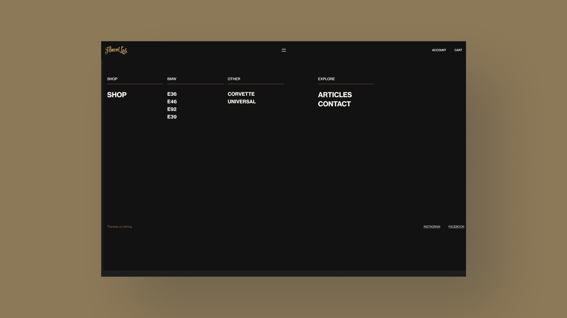
Fitment Lab's catalog is relatively focused, but its products are heavily dependent on vehicle chassis. I organized the navigation around that relationship, allowing customers to move directly between the complete shop, individual BMW chassis, universal products, and editorial content.
Opening the menu transforms the otherwise minimal header into a full-screen index. The layout intentionally feels closer to an editorial contents page than a conventional e-commerce navigation drawer.
product discovery
fitment lab
The catalog became the interface
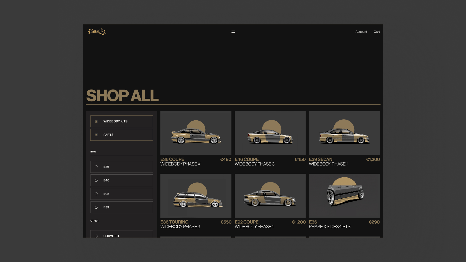
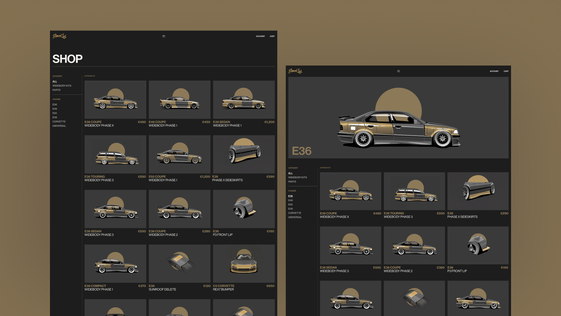
Product discovery was organized around the way enthusiasts already think about these parts: first by chassis, then by component. The shop maintains a dense three-column catalog for scanning, while chassis pages introduce the vehicle visually before narrowing the catalog to compatible products.
Consistent product imagery allows differences in body style, width, and individual components to be understood without introducing additional interface complexity.
product detail
fitment lab
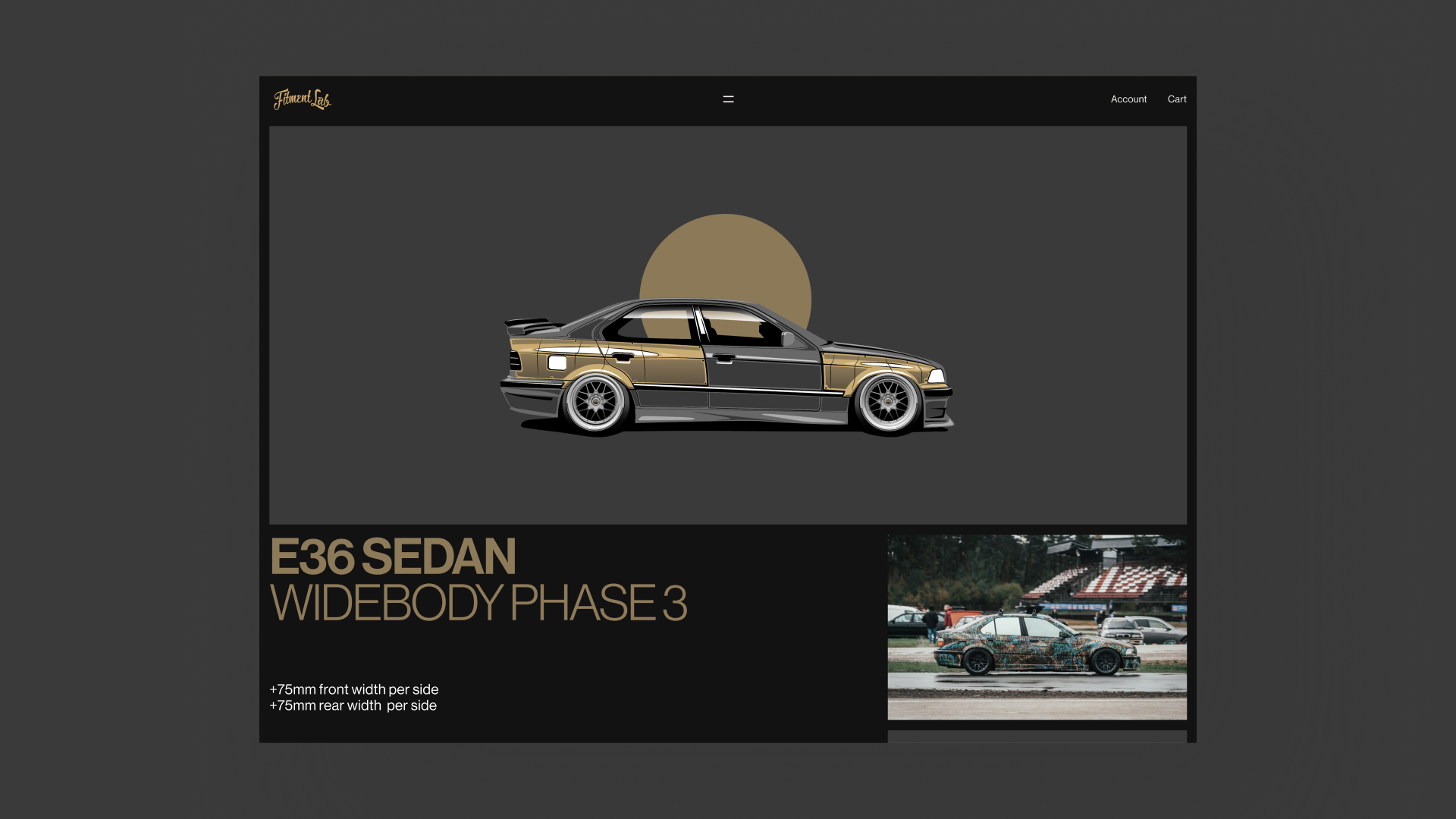
Technical information without losing the car.
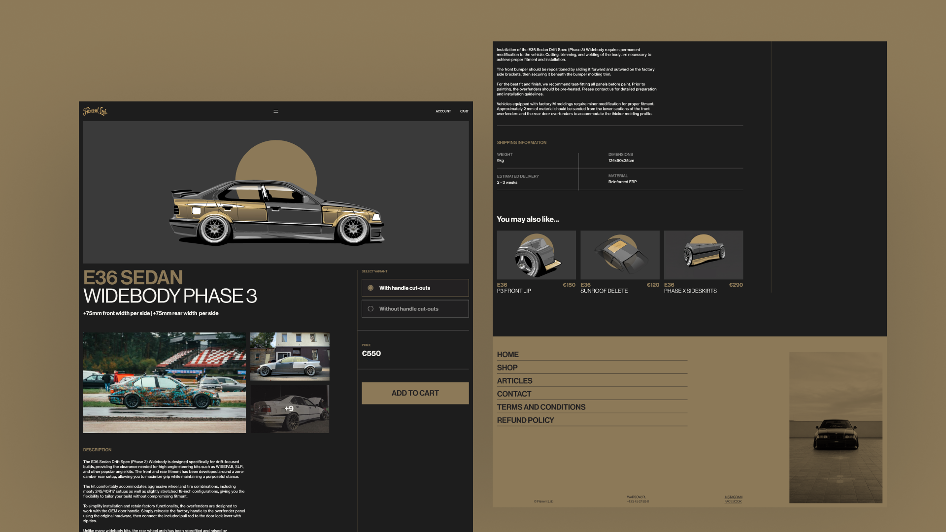
Widebody kits require considerably more consideration than a typical e-commerce purchase. Compatibility, installation requirements, dimensions, material, and fitment all matter before a customer commits.
I structured the product page so the car remains the dominant visual element while technical information becomes progressively available as the customer moves down the page. Variant selection, pricing, and purchasing remain persistent alongside the product content, while installation and chassis-specific requirements are separated into clearly defined sections.
editorial
fitment lab
Commerce and culture share the same system.
Fitment Lab's articles document new products, customer cars, collaborations, and builds. Rather than treating that content as a separate blog, I designed it as another expression of the same visual system.
On the homepage, articles are reduced to a compact index. Interaction reveals photography and supporting context, allowing the section to remain quiet until the customer engages with it. The full article archive then expands that language into a more image-led editorial layout.
footer
fitment lab
Ending with something unexpected.
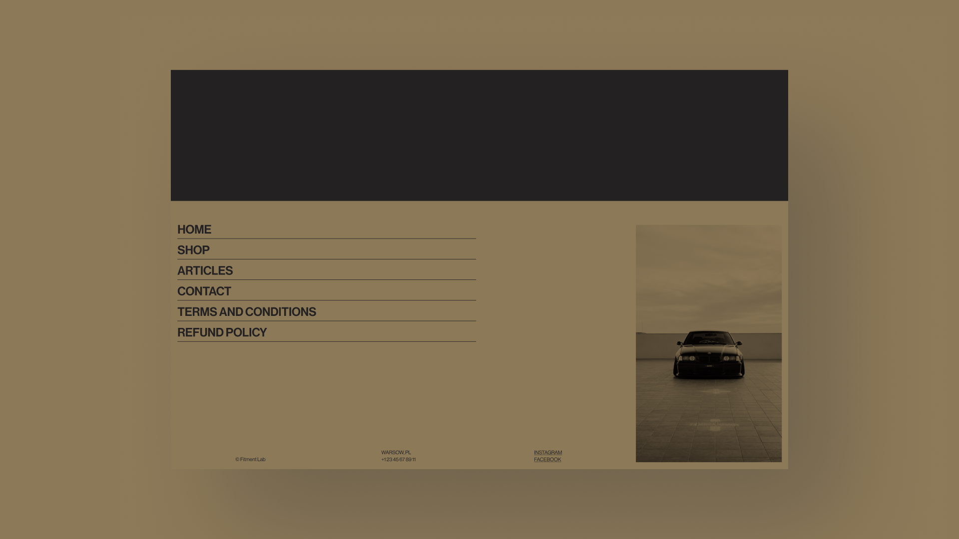
The footer deliberately breaks from the dark interface that precedes it. A full warm-gold field turns a traditionally utilitarian element into one of the site's largest compositional moments.
Navigation is treated as oversized editorial typography, while contact information, location, social links, and photography occupy the remaining space with minimal hierarchy.
final direction
fitment lab
One system, from discovery to purchase.
The final direction brought navigation, product discovery, editorial content, and purchasing into a single visual system—allowing the brand to remain distinctive without compromising the shopping experience.
outcome & reflection
fitment lab
Restraint gave the brand more character, not less.
Because the project was self-initiated, the next step would be validating the navigation, chassis-based product discovery, and purchasing experience with Fitment Lab customers before moving into development.
Fitment Lab became an exercise in finding the point where brand expression and usability reinforce rather than compete with one another. The earlier directions taught me that making the interface louder didn't necessarily make the brand more distinctive.
The final direction came from removing rather than adding—using product imagery, proportion, typography, and structure to create character while allowing the cars and components to remain the focus.