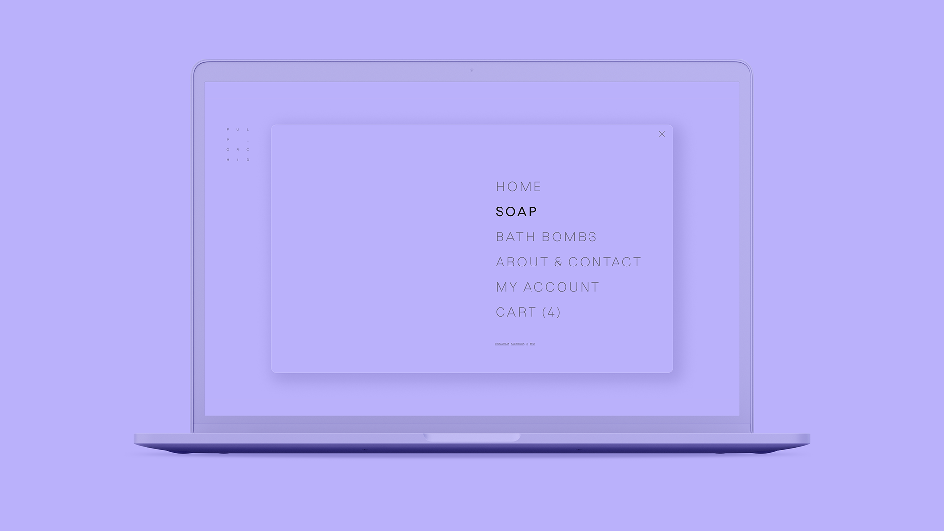
As Pulp_Orchid prepared to move beyond just local sales, the challenge wasn't simply creating a logo or an online store—it was building a brand system that could connect the physical product to every part of the customer experience.
The products provided a natural starting point. Each soap was handmade in small batches using a limited selection of high-quality ingredients, resulting in subtle variations in color and appearance.
The goal was to create a cohesive identity that felt as considered and straightforward as the products themselves, then carry that same thinking through the packaging and into a simple, inviting e-commerce experience.
Pulp_Orchid's identity was built around the product itself.
Their soaps use a small number of carefully selected, high-quality ingredients, and I wanted the brand to reflect that same sense of simplicity and intention. Less is more became the guiding principle throughout the project.

Logo
Color Palette
Packaging
Typography
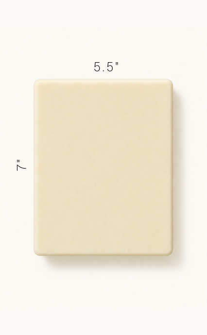
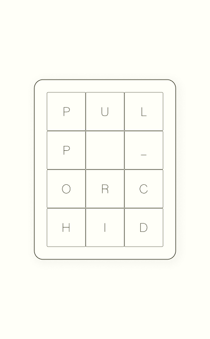
The logo takes its shape directly from the soap mold. Its proportions and rounded corners mirror the dimensions of the mold, creating a direct connection between the identity and the product itself. The logotype was designed to fit within those same proportions, allowing the complete mark to be debossed directly into each bar of soap.
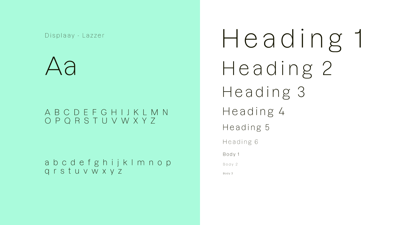
I chose Lazzer by Displaay for its narrow proportions and classical forms, which complemented the simplicity of the identity while giving it a distinct personality. Its unconventional details add moments of character without overwhelming the otherwise restrained visual system.
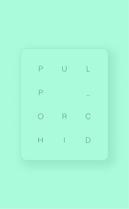
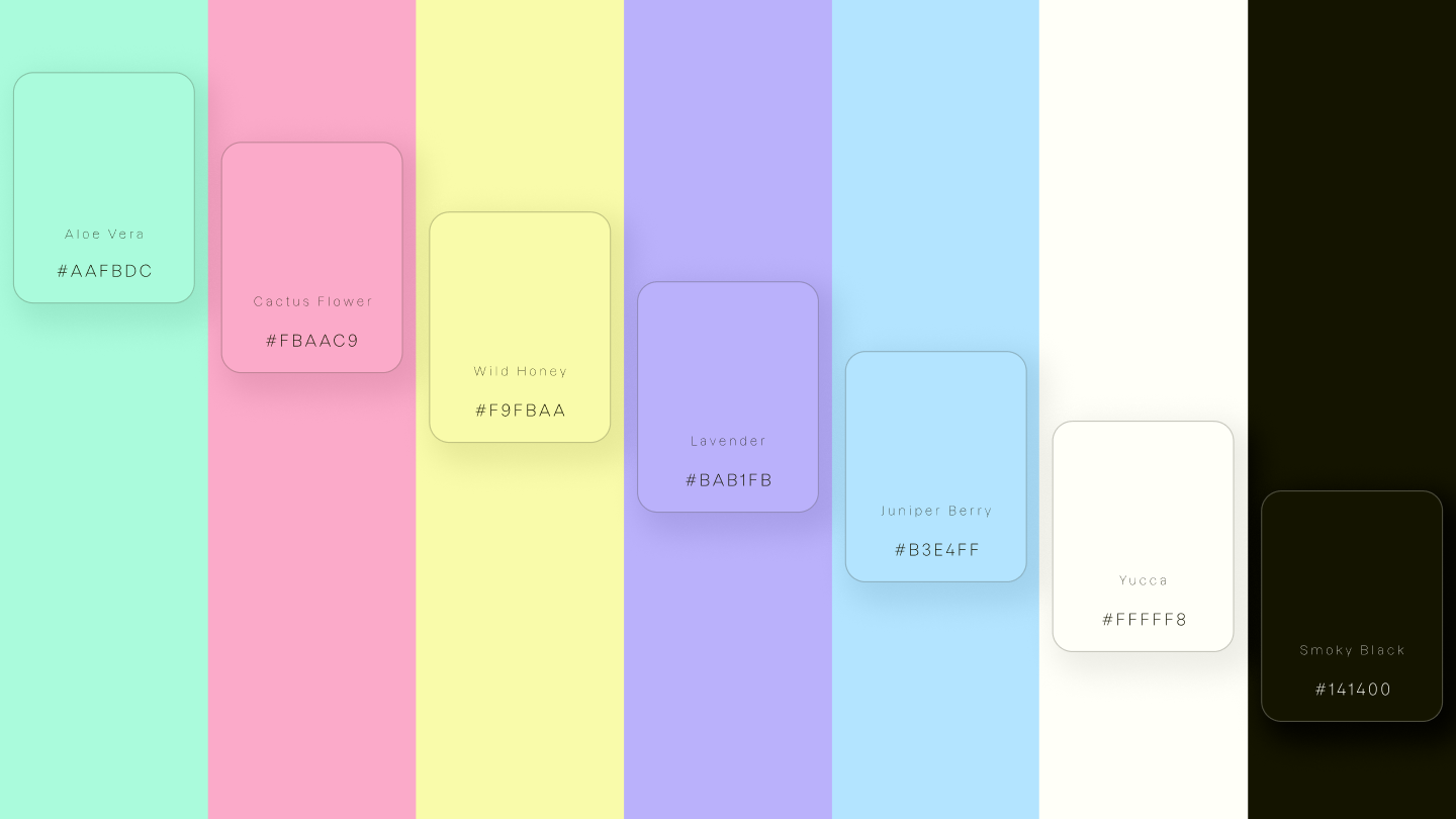
Color provides much of the visual personality within Pulp_Orchid’s otherwise restrained identity. The pastel palette draws directly from the natural ingredients used throughout their products, reflecting the soft, muted colors those ingredients give the finished soaps.
Because every Pulp_Orchid product is handmade, no two batches are exactly alike. The packaging system embraces that variation by pairing each bar with colored kraft paper that complements the natural color of the soap inside. A simple white paper sleeve provides the product name and ingredients, including any custom selections.
e-commerce without images
The identity had to do what photography normally would.
Early in the project, I decided to design the entire e-commerce experience without imagery. Despite the quality and craftsmanship behind Pulp_Orchid's products, visually, a bar of soap still looks like a bar of soap. Rather than relying on photography to communicate value, I wanted the identity itself to carry the experience.
The Concept
A book on the screen.
Without imagery to structure the experience, I looked for another familiar way to organize content. I landed on the idea of treating the website like an open book—giving the interface a defined container with consistent page proportions rather than allowing content to expand freely across the screen.


The Grid
I built the layout around the Van de Graaf canon, a method traditionally used to establish proportions and margins in book design. I adapted that structure into a digital grid, creating a consistent framework for organizing content while preserving the feeling of a printed page.
Wireframes
With the structure established, I used wireframes to explore how the websites content could work within the same book-inspired grid. Each page could take on its own composition while still feeling like part of the same underlying system.
the e-commerce experience
The interface became the storefront.
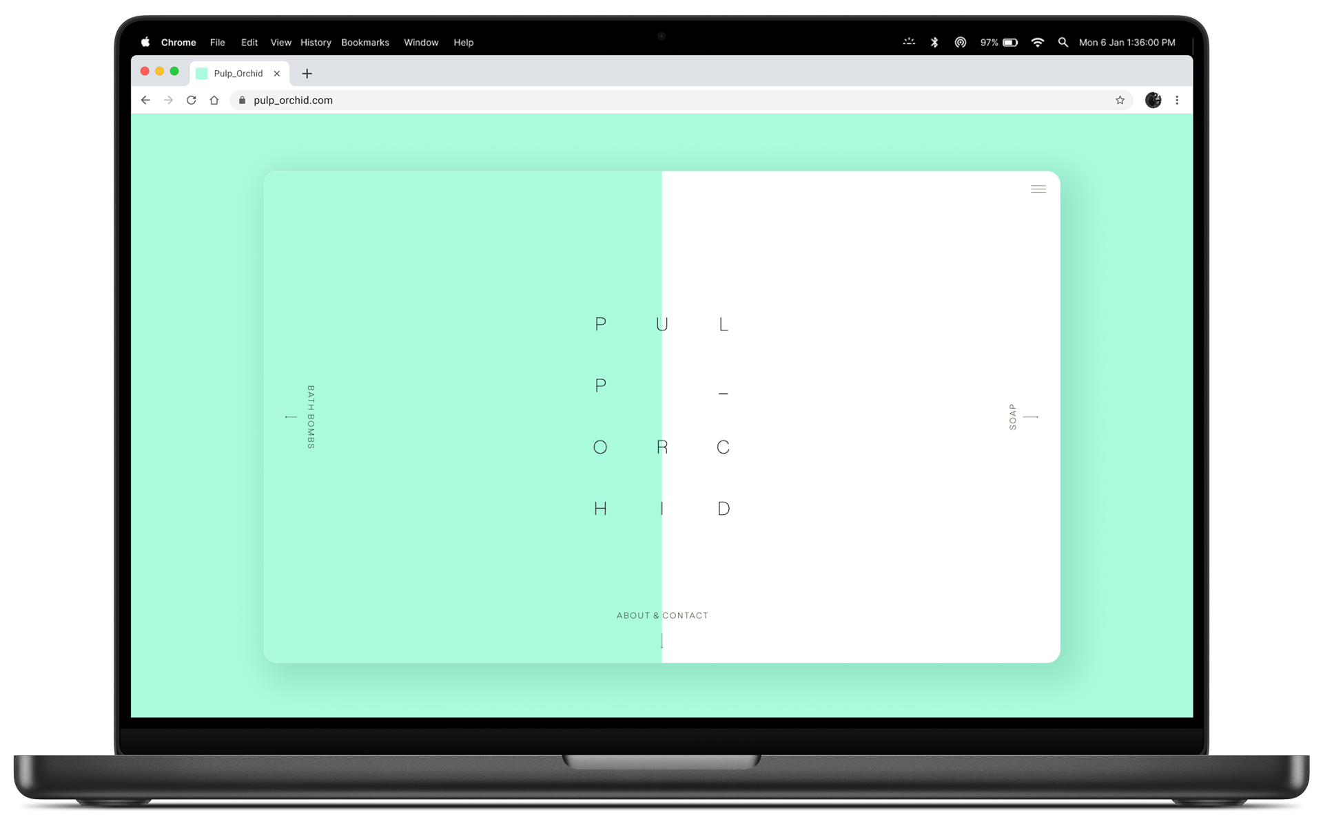
Without imagery to differentiate the products, the final experience relies on the visual system established throughout the project. Typography, color, whitespace, and the book-inspired grid give each product its own identity while maintaining a consistent experience from discovery through checkout.
The interface was kept intentionally restrained, allowing product names, ingredients, and variations to become the focus. Bold shifts in color provide distinction between products and pages, while the underlying structure remains consistent throughout the store.
If the project had moved forward, the next step would have been validating the image-free shopping experience with customers—particularly whether the identity and product information provided enough context for users to confidently browse and purchase without photography.
The project ultimately didn't move into development, but resulted in a complete brand and e-commerce direction spanning identity, packaging, and digital experience. Working across each of those touchpoints gave me the opportunity to build a visual system from the ground up and explore how the same underlying ideas could translate from a physical product into a digital experience.